
Class schedule optimizing tool for NYU students
Class schedule optimizing tool for NYU students
ROLE
Product Designer
COLLABORATORS
2 Developers
TIMELINE
2 Months
TOOLS
Visual Design
Prototyping
Micro Interactions
OVERVIEW
Quicker Class Scheduler
Einstein creates all possible schedules for your classes, so you can simply sort schedules and add new options with ease — while also helping you discover new classes.
The Challenge
NYU students rely on Albert, the course registration site, to find classes and build schedules. But Albert is confusing and hard to navigate, turning registration into a tedious, time-consuming process.
Our Live Website! (˶ᵔ ᵕ ᵔ˶)
https://www.einsteinnyu.com/
After Einstein's Launch
After Einstein's Launch
The issue
The issue
Our registration website, Albert, has a confusing layout making it hard to efficiently pick classes
Our registration website, Albert, has a confusing layout making it hard to efficiently pick classes
Our registration website, Albert, has a confusing layout making it hard to efficiently pick classes
Albert, NYU’s current website for finding courses has an interface that is not intuitive and many users find hard to navigate. During registration, the difficulty students face in swiftly replacing courses or accessing vital information hinders their overall experience.
Albert, NYU’s current website for finding courses has an interface that is not intuitive and many users find hard to navigate. During registration, the difficulty students face in swiftly replacing courses or accessing vital information hinders their overall experience.
Albert, NYU’s current website for finding courses has an interface that is not intuitive and many users find hard to navigate. During registration, the difficulty students face in swiftly replacing courses or accessing vital information hinders their overall experience.
Key Feature 1
Key Feature 1
Easy to Find Classes
Easy to Find Classes
Easy to Find Classes
The redesigned explore page enables easier access to essential information by reducing the number of pages users need to visit.

Key Feature 2
Key Feature 2
Quick Hover Preview
Quick Hover Preview
Quick Hover Preview
Hover preview allows for quick assessment of possible schedule combinations (and trust me, there are a lot).

Key Feature 3
Key Feature 3
Task Completion Feedback
Task Completion Feedback
Task Completion Feedback
I used micro-interactions to show users that edits to one page would affect the other.

User Interviews
User Interviews
I was able to conduct user interviews, and I uncovered 3 key insights about the user journey
I was able to conduct user interviews, and I uncovered 3 key insights about the user journey
We discovered that students think the user journey is unclear. Many screens have too many features with their purpose being unclear, causing cognitive overload during an already stressful time.
We discovered that students think the user journey is unclear. Many screens have too many features with their purpose being unclear, causing cognitive overload during an already stressful time.
We discovered that students think the user journey is unclear. Many screens have too many features with their purpose being unclear, causing cognitive overload during an already stressful time.

Problem Statement
Problem Statement
How might we create a tool that lets students build optimal class schedules with minimal friction, so they can avoid time conflicts and reduce stress during enrollment?
How might we create a tool that lets students build optimal class schedules with minimal friction, so they can avoid time conflicts and reduce stress during enrollment?
Design Principles
Design Principles
Aside from functionality we wanted to adhere to a few design constraints during the project with the issue of finding Albert hard to navigate
Aside from functionality we wanted to adhere to a few design constraints during the project with the issue of finding Albert hard to navigate
Aside from functionality we wanted to adhere to a few design constraints during the project with the issue of finding Albert hard to navigate
These design principles were chosen to create a delightful experience that entices users to continue using the website due to its easy-to-use nature.
These design principles were chosen to create a delightful experience that entices users to continue using the website due to its easy-to-use nature.
These design principles were chosen to create a delightful experience that entices users to continue using the website due to its easy-to-use nature.

Proof of Concept
Proof of Concept
We worked on creating a the basics of the website: schedule options and categorizing classes
We worked on creating a the basics of the website: schedule options and categorizing classes
We worked on creating a the basics of the website: schedule options and categorizing classes
This was our first time seeing if the idea was technically feasible. The design is not very thought through, but it has the simple features mentioned above.
This was our first time seeing if the idea was technically feasible. The design is not very thought through, but it has the simple features mentioned above.
This was our first time seeing if the idea was technically feasible. The design is not very thought through, but it has the simple features mentioned above.


User Testing
User Testing
I had the opportunity to test out our first version with NYU students
I had the opportunity to test out our first version with NYU students
I had the opportunity to test out our first version with NYU students
Due to time constraints, I was only able to find these students to test with, but if I had more time I'd love to hear from more classes (more freshman, sophomores, seniors.)
Due to time constraints, I was only able to find these students to test with, but if I had more time I'd love to hear from more classes (more freshman, sophomores, seniors.)
Due to time constraints, I was only able to find these students to test with, but if I had more time I'd love to hear from more classes (more freshman, sophomores, seniors.)


Iteration 1
Iteration 1
We introduced a toggle tab for course information, letting users access what they need without overwhelming the main page
We introduced a toggle tab for course information, letting users access what they need without overwhelming the main page
We introduced a toggle tab for course information, letting users access what they need without overwhelming the main page
I decided to make this a toggle tab because I felt it would make sense that the classes you could add on this page were going to be added to the scheduling page.
I decided to make this a toggle tab because I felt it would make sense that the classes you could add on this page were going to be added to the scheduling page.
I decided to make this a toggle tab because I felt it would make sense that the classes you could add on this page were going to be added to the scheduling page.

Mapping User Flows
Mapping User Flows
Feedback centered on color accessibility and clearly showing users that edits made on one page would reflect on the other
Feedback centered on color accessibility and clearly showing users that edits made on one page would reflect on the other
Feedback centered on color accessibility and clearly showing users that edits made on one page would reflect on the other
I wanted to remap how users added courses while being on the explore page, so I came up with the idea to make people add their courses and then choose to categorize them in "want to take" or "need to take"
I wanted to remap how users added courses while being on the explore page, so I came up with the idea to make people add their courses and then choose to categorize them in "want to take" or "need to take"
I wanted to remap how users added courses while being on the explore page, so I came up with the idea to make people add their courses and then choose to categorize them in "want to take" or "need to take"


The MVP
The MVP
In the end, I was able to ship my project and am planning to launch our MVP Fall 2025
In the end, I was able to ship my project and am planning to launch our MVP Fall 2025
In the end, I was able to ship my project and am planning to launch our MVP Fall 2025
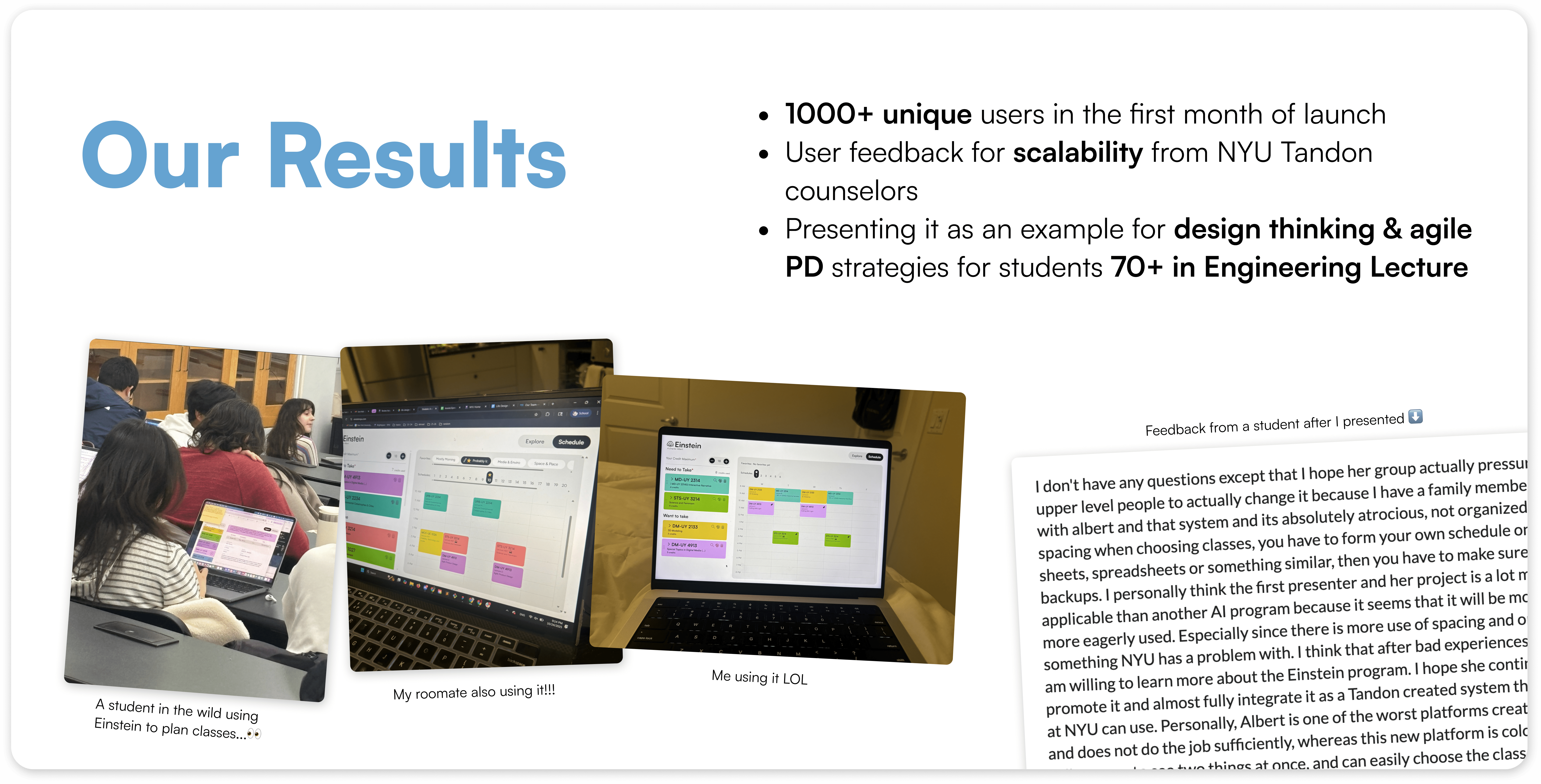
Update 11/8/2025: We officially launched and have over 1000 unique users, find us at einsteinnyu.com
Update 11/8/2025: We officially launched and have over 1000 unique users, find us at einsteinnyu.com
Update 11/8/2025: We officially launched and have over 1000 unique users, find us at einsteinnyu.com
