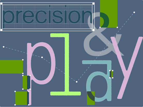
My first love as a designer were zines. The curation of content carefully laid out into a scrappy booklet about art, politics, music, fashion, or other subjects of today’s cultural zeitgeist, drew me into the world of design that I had never known existed.
When I first began designing for my own zine, one of the first things I struggled with was choosing a font. Why did some fonts feel too detailed for a page? Why did others seem like they felt too generic? Why did Illustrator keep cropping out half of the word I typed, replacing the neglected half with a red plus sign?
I wondered these questions while working on a variety of projects during my high school years, though never truly figured out the answers until taking a foundational course in graphic design my first year of college.
Letter height. Kerning. Weight. San Serif.
Terms that I never knew were some of the key ingredients in the final recipe for a typeface. Looking back now, these components feel fundamental to the overall composition of a design, yet understanding what they mean and how to use them intentionally can dramatically shape the impact of a piece. Even the smallest changes in values for these key variables can influence the feeling of a work.
Mastering typography and hierarchy provides creatives a solid backbone for their designs, and Laura Garcia Mut, founder of the Hard Type Foundry, describes this relationship with typography when she states, “What I’m sure of as a graphic designer is that in my practice typography is the most important component of a piece. I can refuse color, but type always vertebrates and sustain my work.” Choosing the correct type can influence the storytelling, tone, and impact of a message.
This is true for graphic design, however product design type tells us a different story.
In contrast, product design treats type as a minutiae, something part of a larger system of components. Type is now a design primitive whose job is to clearly communicate what thing does what action. They are crucial for users to process information in a way that is clear. Clean sans-serifs and mono space fonts have become increasingly popular among UX and product designers to achieve the aforementioned characteristics. I can’t help but feel a bit restricted by legibility rules and accessibility standards in typography, though these constraints now make my graphic design heart happy whenever I see funky fonts on the web or used in digital projects.
One kind of website that I feel especially giddy exploring due to this very reason is type foundry websites. So, this article serves as a vault of different type foundries that type to create these unique digital spaces that push boundaries of “good” web design.
Ultimately, through examining these examples, I’m reminded that while rules exist to guide us, intentionally breaking them can create work that feels fresh and exciting. As an early-career designer, I often hear advice from a wide range of sources — from design Twitter to colleagues — so it’s reassuring to realize that design is ultimately a form of expression. More than anything, the process comes down to trusting your instincts. As Margot Lévêque states, “I feel free in my choices, I decide everything from beginning to end… I work a lot with my instincts.”
While type might be something almost unnoticeable to the people I create for, I am reminded that the best typography often works quietly. It guides, clarifies, disrupts, or evokes emotion without demanding attention to itself. Whether it’s the rigid structure of a product interface or the expressive chaos of an experimental foundry website, type has the ability to completely shape how we experience a piece of design.
And maybe that’s what continues to draw me back to typography after all these years. Beneath every interface, poster, zine, or website is a series of intentional choices: the spacing between letters, the weight of a headline, the rhythm of a paragraph. What once felt intimidating to me now feels deeply human — a balance between systems and instinct, precision and play.